
Market At-A-Glance: what it tells me right now
New Market Heatmap feature tells us where high investment risk is hiding...in plain sight

After a weekend where everything was at stake, nothing happened, and markets yawned (for now), I was deciding between writing to you about market conditions, or about the latest new feature at our analytics site, ROAR.PiTrade.com. Then, as I was telling the live Tuesday group last week, I looked at the site this morning, and realized that the enhancement “wish list” I created just a few days ago…is up and running already!
This snapshot doesn’t do it justice, as there are 75 market sectors, industries, themes, regions and asset classes in the full table. I’ve only been looking for something like this around my ROAR Score methodology for like, 20 years.
I can’t wait to use it on tomorrow’s live session for premium subscribers, and every session to follow. Best “chalkboard” I’ve ever had!
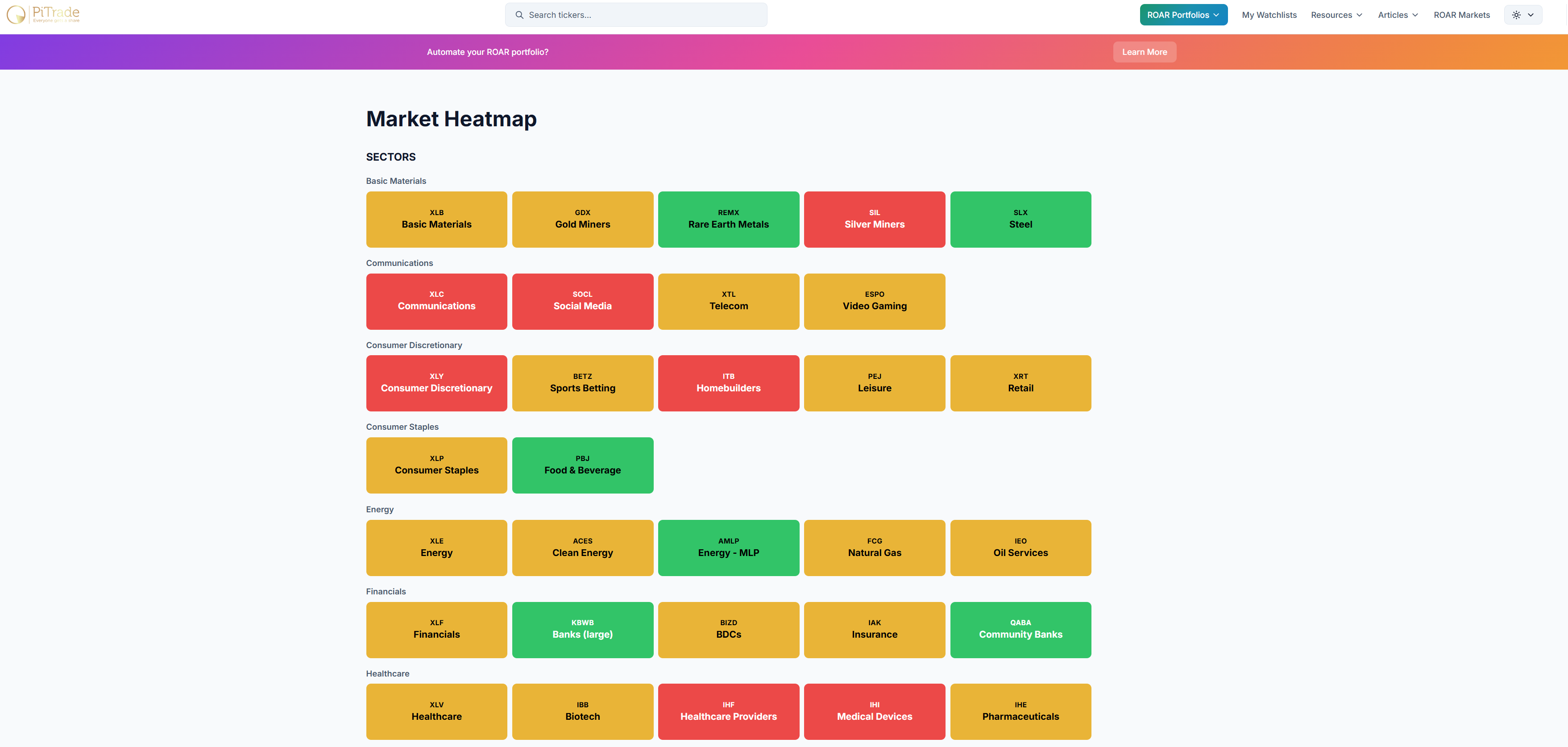
So, I’m able to do both today: talk, markets, while introducing a new feature. One I think could be as valuable as any other on the site.
This link will get you there, so check it out: https://roar.pitrade.com/marketSummary