ETF Yourself

ETF Yourself

RESEARCH

S&P 500: Here's What Happens Next

A plunge, a rally, and a...

ETF Yourself's avatar
ETF Yourself
Apr 01, 2026
∙ Paid

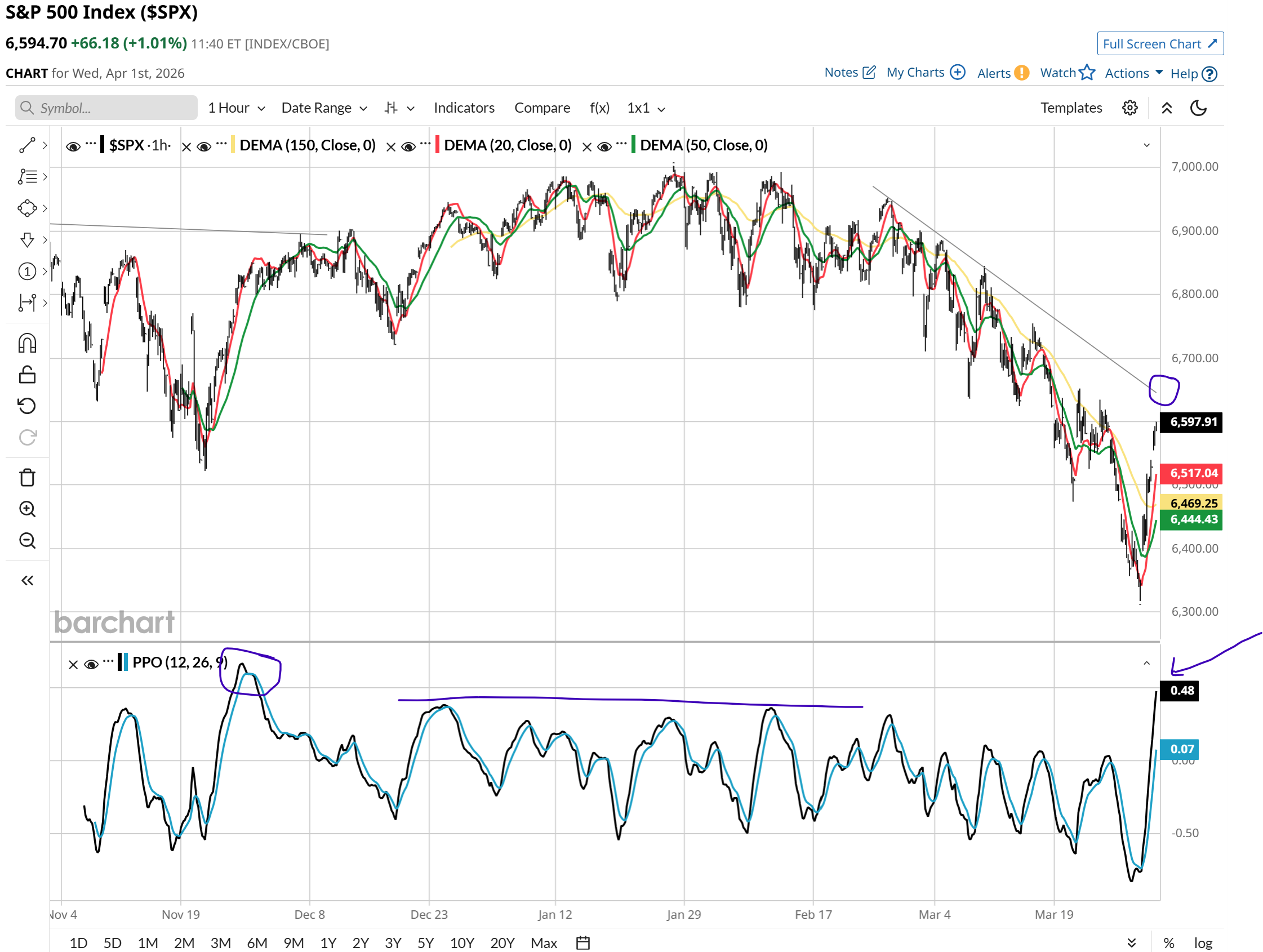
What’s this chart all about, with the purple circles, arrows and lines and all that jazz? I think it is snapshot primer on how a particular veteran investment industry strategist (me) assesses potential return and risk in markets that do what we just saw during March.

That’s the chart. Now the explanation and my forward-looking view.

This post is for paid subscribers

Already a paid subscriber? Sign in
© 2026 Dana Isbitts · Privacy ∙ Terms ∙ Collection notice
Start your SubstackGet the app
Substack is the home for great culture