The 3's Report
From timely to timeless, the 3 most important points we can make about stocks, bonds, ETFs, markets and investing...updated weekly
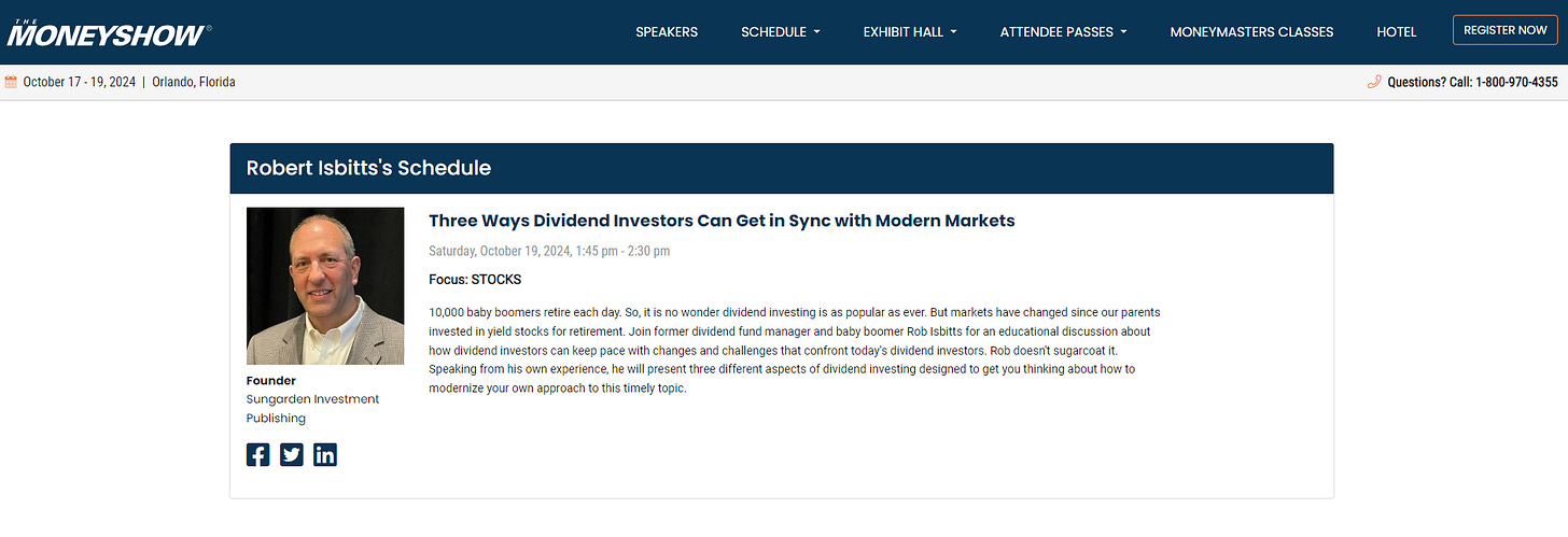
Sungarden Founder Rob Isbitts to speak at Money Show Orlando next month

I am part of the Money Show’s educational provider group (i.e. not paid for as a sponsor), and after a few online sessions earlier this year, my first live session will be at the huge Money Show Trader’s Expo in Orlando next month. My focus: DIVIDEND INVESTING. Our subscribers know well that my views on dividend investing in modern markets are quite a departure from the “same old” and I’m grateful to the Money Show crew for inviting me to be part of this long-running event.
Registration for the 3-day conference is HERE and if you will be there, let us know. Dana and I will be there most of the day Friday and all day Saturday, the day I speak. We’ve love to meet any folks from the Sungarden community there and say hi!
ALL SUBSCRIBERS (full and ETF-only subscription levels): the weekly technical scores for ETFs have been updated in the shared research deck.
SIRG SUBSCRIBERS ONLY: we expect to add the stock technical ratings and a full YARP™ dashboard by this time next week. It covers our 40-stock portfolio plus another 35 stocks on our watchlist, but not currently in the portfolio. Stay tuned!
ROAR Score weekly update
Remains at 30 for the ninth straight week (last changed on 7/30, when S&P 500 was at 5436). So the 2-ETF portfolio stays at 30% SPY + 70% BIL.
Why am I so stubborn about raising it when the market “keeps going up?” Because ROAR is not a fully-automated indicator. It is a risk-management-first gauge of my “in one word” assessment of reward and risk.
As shown among the 3 charts at the bottom of this post, S&P 500 is still just in a tight trading range that started back on 7/16, shortly before I dropped ROAR from 40 to 30. Headlines about “new all-time highs” sound cool, but as I noted with Tesla (TSLA) last week, getting to a key price area and breaking out from it are 2 very different things. So 30 continues to be just fine for this ‘ole risk manager!
3 Quick Thoughts on markets
Bonds are not all the same (though many investors tend to treat them like they are). As the Fed starts to lower short-term rates, the longer end of the yield curve is not necessarily following along. TLT is down nearly 3% since last week at this time. If short-term rates fall and long-term rates rise, that’s how the yield curve continues to “revert” to normal, as opposed to the 2+ years of “inversion.” Again, something on the list of “things that happen leading up to a recession.” But until the market votes (by dropping stock prices), it is just adding to the chatter.
Is the election impacting the stock market? If it is, it is manifesting itself via a lot of flip-flopping around in prices. Which I guess is par for the course with today’s political class, regardless of party. This ought to intensify in October, but if the race continues to be a tossup all the way until the 11/5 election date, perhaps more of a “coiled spring” effect dominates, rather than the market getting ahead of itself.
November 5 could be significant for another reason. As it stands now, EQAL, the ETF that tracks the 1,000 largest US stocks, is just about break-even with where it was on that date…3 years ago! So if it doesn’t rise sharply from here, we’ll complete 3 years of “nothing” for the average stock. And if it dips during the next 6 weeks, that will only prolong the time between that 11/5/21 top in EQAL and the completion of the “zero return” period. This is the type of math I focus on A LOT. Why? Because in a case like this, it will either be the signal that the “headline” indexes were too frothy, or serve as a 3-year “pause/stagnation” period for many stocks, which is what progresses into a new up cycle for the broader stock market.
3 great takes from others
If I were teaching a class on investing, THIS would be required listening. It’s my friend Chuck Jaffe, who runs an awesome daily podcast called MoneyLife, interviewing Jonathan Clements, longtime (former) WSJ personal finance columnist. Mr. Clements, whom I have followed for a very long time, talks about what he is doing following recently receiving the news that he is terminally ill. Forget everything else in this week’s post if you wish. This is the one to hear.
If, like me, you are happy to have the market fly higher from here, but are constantly looking for signs of a recession to change that, this is where it starts. Job openings decline, tightening the labor market. If it continues and pivots to more layoffs, the proverbial recession ball starts rolling downhill. Something to watch. As the author of the post states: Such sharp drops have only occurred 3 times since 2000: - Dot Com bubble - Financial Crisis - Pandemic All of them ended with a sharp economic downturn.
And yet, in this world of constant news and opinion flow, there’s THIS.
3 ETF (or index) charts I’m watching
Recovery from an 8.5% decline? Check. Breaking out in a way that encourages me to allocate more than 30% of a stock/cash portfolio to stocks? Not yet. I continue to believe that 7/16 has at least the potential to be one of those dates we look back at and say, “that was the end of an up cycle.” If it isn’t and the S&P 500 rally continues, I’m positioned for that too. That’s the bottom line here: who cares what your “forecast” is?! I prefer to spend my time doing simpler things, like figuring out how to make money no matter what that inanimate object (the market) does next. Keeps my blood pressure closer to normal LOL.
Charts like this are why if someone hired me to do it, I’d write about the “story” charts try to tell we investors every day. After 44 years of it, I’ve seen a few things!
What do I see here? Maybe an election indicator. The market assumes that a Trump win will not help alternative/”clean” energy stocks, and that a Harris victory will. This clean energy ETF, one of 90 US ETFs I follow for our subscription service, tells me that with this industry having transitioned from a 50%+ drop (ironically, under Biden-Harris), it has spent 2024 just hanging out.
Translation: if it does perk up from here, for whatever reason, there’s a ton of upside ahead. And oh I’ll be watching to see if that move is getting in gear. Because I like to make money when flat turns to up. All part of the chart thing.
How interesting is this stock market right now? I found all the “stories” I needed from my 90-ETF list, and only got as far as the letter B alphabetically! See bottom of chart here. A lot of recently surging industries look like this one (Biotech). Rallied nicely, but lower part of chart (far right side) shows PPO potentially doing a slow rounding top thing. Sell signal? Nope. Watch closely signal? Yup. FWIW, BBH is not part of my current portfolio.
3 stock charts I’m watching
This week, I’m going to simply show 3 charts of monthly stock prices. One that looks pretty good, one that looks pretty bad, and a third that is saying “I dunno.” Monthly charts used to be only for very long-term investors. But the way stocks move these days, up and down 10% in a month or 30% in a half a year, monthlies are at least a bit more intriguing to me.
And before I add any stock to my 75-stock watchlist or 40-stock portfolio, I at least glance at the monthly chart, just as a final “rule out” step. Because while my tactical YARP™ stock portfolio has 40 names but the weightings fluctuate frequently (1% minimum position, 5% maximum position), I don’t want to even commit myself to a 1% position if the monthly chart looks outright dangerous to me. OK, enough of the setup and not-so-subtle commercial for my investment process, here are those charts!
LOOKS GOOD
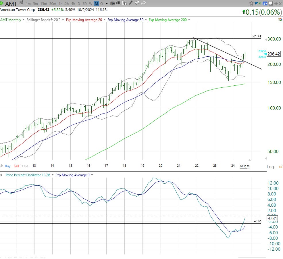
This is not your typical REIT. It builds and own cell towers, not office buildings or housing developments. But several REITs look like this: up but maybe long-term higher. I’m up 27% on this one since my initial May 9, 2024 purchase, but have traded around it a bit, with position having been 1%, 3% and 5% at different points during that time. That’s YARP investing for ya. But that long-term breakout encourages me, and likely keeps this on in my “top 40” portfolio for a while.
LOOKS “LOST”
Not as in “lost money” as I documented recently in an article for Seeking Alpha. Happy to admit I lucked out a bit by tripling my position in it during the summer, a day before a new CEO was announced. which popped SBUX stock 22% higher the very next day. But that caffeine boost has worn off. I still own it, but at only a 1% minimum position. Now it is time for the new CEO (and in turn, the stock) to generate profits, not just excitement. No clear signs in the monthly chart either way at the moment. So this is the aforementioned “I dunno” chart of the threesome.
LOOKS BAD
Oil stocks just look weak to me. I jettisoned COP from my portfolio over the summer, and while CVX is still a 1% holding in my YARP portfolio, I see no signs of lifting that. Still I use these monthly charts lightly, since so many tactical opportunities are glossed over by just looking at month-end prices of a stock.
I’ll also point out that CVX looks a lot like it did back in early 2009, chart pattern-wise. That was when the overall stock market was trying to bottom to end the global financial crisis. What happened with CVX then? It fell another 15%, and that was the end of the damage, though it was pretty chaotic price action for a while.
Bottom line: risk management is as much choosing what battles to avoid, rather than what risks to take. In this case, my 1% CVX position is simply a “token” or toe in the water in the energy sector, which also happens to be a very small part of the S&P 500 index. But as we move forward, I’ll be watching for signs that the sector gets washed out, long-term.
Coming soon
YARP research deck updates
Video tutorial on the both new research decks
A 2nd version of the ROAR Score (different from existing one)…the big reveal soon


