
The Short of it: 3 ugly ETFs I'm calling out
In my usual Monday review of 75 ETFs, this trio are among the most dangerous. That list is full of vulnerable charts, but these 3 stand out even more.


Before I show you 3 great examples of ETF charts that are VERY risky, even if they don’t follow through to the downside, a comment and a question:
THE COMMENT: I’ve been sharing these “Almost Daily ROAR” posts for a while now, and I’ve loved seeing how this community uses these insights to navigate the markets. The ROAR research system I created with PiTrade, is easy to use and free for now. But the goal of these daily posts is to gradually help investors and traders use ROAR to the fullest. We created a powerful tool, and we want every investor to quickly determine how best to use it to their own, personal advantage.
To keep the analysis high-quality and focused, the Almost Daily ROAR will move behind the paywall on Monday, March 9. If you find value in these risk-managed deep dives, I’d love for you to stay with us.
You can join the inner circle for $15/month, or grab a full year for $150 (gives you 2 months free). Let’s keep building this together.
THE QUESTION: I’ve long believed that investors have an overwhelming number of places to see insight. Yet very few of those sources focus on what to avoid. The markets have been so easy for so long, they play to the excitement and greed of a mass audience. Good for them, but that’s not what we are about here.
This is business. This is my hard-earned wealth and yours. So to me, the “gap” to fill is not another “best picks for right now” service. It is one that certainly points out how to play offense, but really zeroes in on the defensive side of investing. To borrow an old phrase “Love means never having to say you’re sorry.” As I see it, if you love your money, you never want to have to say “sorry, I had no idea that ETF or stock I hold could cost me that much money.”
So if you like today’s post, which focuses on “not losing,” let me know. Because part of what we soon put behind the paywall can be a regular series of these “avoiding disaster” notes from me. This seems a good time in the market cycle for that.
Now, to today’s Almost Daily ROAR
Once Monday morning’s market activity has settled in, I typically review a list of 75 ETFs. Later this month, I’ll be sharing that list with paid subscribers, as we greatly expand the features at ETFYourself.com. By reviewing this list of 75 indexes, I get a great total view of the global markets. I’ve culled the list down from hundreds over the years, so as to reduce redundancy. '
A big investor error I see is that they follow many ETFs that essentially are the same thing in different packages. I’m in my 34th year of ETF analysis, so I’m trying to use my experience in research and ETF portfolio construction to help a wider audience.
So it is notable this week that I found these 3 below. Their charts look awful, rolling over to different degrees. And their snapshot pages from ROAR.PiTrade.com our currently free analytics site for ETFs and stocks, confirms what I see in the technical charts.
You’ve seen the billboards for “We Buy Ugly Houses.” My message here is “I don’t buy ugly charts.”
As ROAR Scores indicate, there is always a chance an ETF or stock can rally. But when the odds are long, I tend to either stay away, or keep my position size very low.
The first one is ACES, which is a clean energy ETF I’ve tracked for a while. The chart is anything but clean, and the ROAR Score of 20 reflects it. In general terms, it has a 20% chance of a big move up, and an 80% chance of a big move down. I don’t like those odds. ACES has dipped about 8% since it turned red last month.
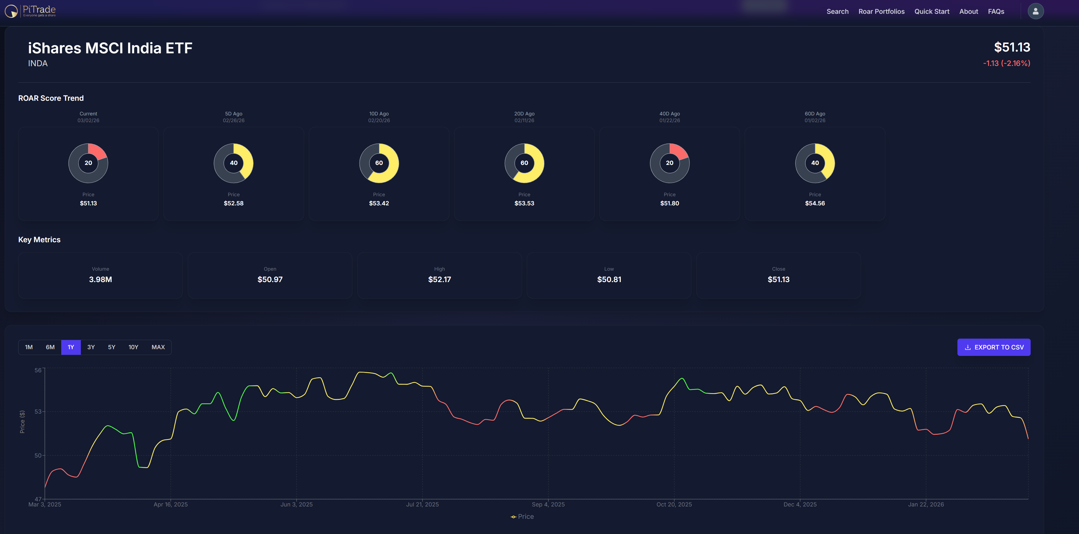
India (INDA) is next. A classic example of how a long-term, secular economic growth story like this will rarely be a straight up shot for the ETF’s price. INDA turned to red (ROAR Score 30 or less, its 20 today). Perhaps just as helpful is the fact that it has failed to maintain a green score (70 or higher) for most of the past 12 months. Only during the market-wide liftoff last April did it spend much time in a range that would imply strong return vs. risk. INDA is about flat over the past 2 years. It has shown signs at times, but currently it is in a high-risk formation. That’s what ROAR is telling us.
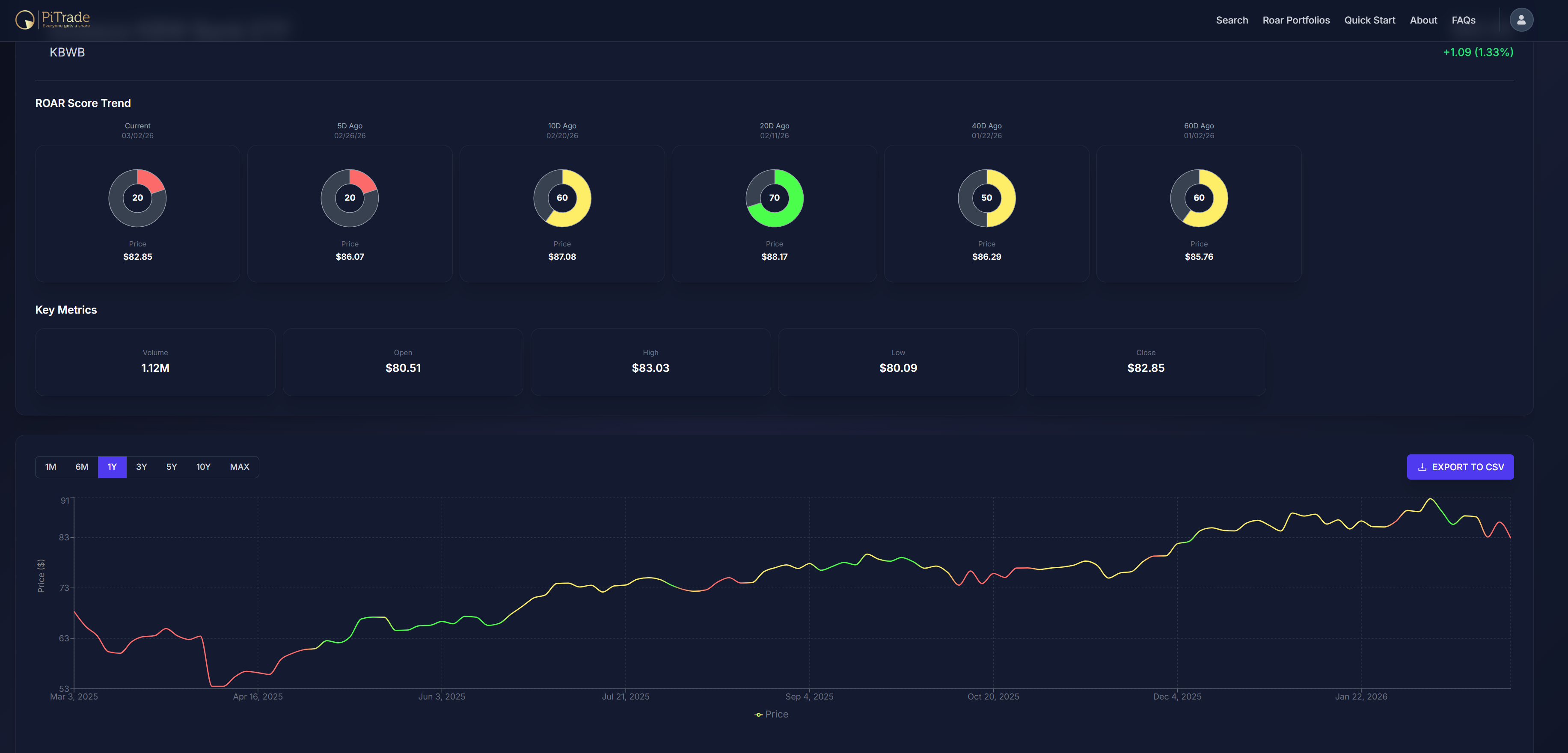
The last one for today is KBWB, a bank ETF. Another 20 ROAR Score, another droopy chart pattern. And an ETF/industry that has had a very tenuous ride higher, likely due to the hope of lower interest rates.
In particular, if short-term rates fall hard and long-term rates dip but less so, it leads to a “steep” yield curve. Translation: banks can lend at higher long-term rates and borrow (paying account holders) at lower short-term rates. Its a spread business.
However, as I’ve noted in our paid weekly version recently, the bond market can’t seem to pick a direction. And private credit markets are starting to spook the financial sector. I’ve lived and invested through every financial system meltdown since the 1987 crash. And while we never know if this will be the next one, the banks will likely be a canary in the coal mine. Worth watching closely.
Final thoughts for now
Sometimes, I need to cherry-pick this list of 75 ETFs to find 3 with setups as ugly as these. But take note: I decided to write this post after finding 3 of them despite only getting as far the letter “K.” I still have more than half the alphabetical list to review! I’ll cover more of those in tomorrow’s Tuesday Weekly ROAR.