

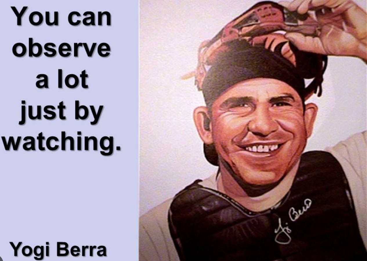
It is true what Yogi Berra said. You can observe a lot just by watching. The late, great NY Yankees Hall of Fame catcher left us with a lifetime of learning, including that quote. As you might know, I’m a bit of a baseball historian, and that includes the culture of the game, not simply the on-field activity.
And when it comes to Yogi quotes and a lot more about how baseball and life intersect, Yogi’s granddaughter Lindsay Berra has done some great work preserving that, including the family’s creation of a museum in my home state of New Jersey, and a documentary about Yogi’s life, career and impact after his playing days. It is great stuff for sports fans and investors alike.
I say that because when I think about why I feel so strongly about my stock and ETF charting, which I started at age 16 when my late father, a big Yankees and Yogi fan his entire life, taught me. Using pencil and graph paper, writing the charts by hand.
But you can speed up the process nowadays. So much so that using Barchart.com’s quick flipcharts tool, I can zip through watchlists in minutes, looking for what I consider to be high-percentage setups. Kind of like Yogi Berra’s remarkable percentage in not only getting to the World Series with this team, but winning it. 15 appearances in 19 years, and 10 wins.
Last Thursday, I debuted a new feature here. Fresh Charts provides a quick, to the point, bottom-line analysis of the best setups I see across several hundred charts each week. It is not a “buy/sell” list. There are plenty of those around, and from what I gather, their batting average is well below Yogi’s .285 lifetime mark. Getting a hit 28.5% of the time, and knocking 358 homers while guiding the pitching staff was a Hall of Fame resume for him. A 28% “hit” rate on trades is not quite HOF material.
As I see it, if I’m looking at upwards of 1,000 stock and ETF charts every weeks, and often multiple times a week for some segments of that list, the best thing I can do to transfer what I see to you is to document it weekly. Markets are more antsy than I’ve ever seen, so that’s why I chose a weekly snapshot, not a “buy this now” sort of thing.
As I see it, if you are a true DIY investor, you want the RESEARCH. We provide plenty of answers in our model portfolios and that is where you can go to truly “copy off Rob’s paper.” All you want, across multiple models. Some are reserved for premium subscribers, but most are free for anyone who enters their email address to sign up.
With Fresh Charts, the goal is to get you the “raw material” each week, so you can personalize it as you wish. But there’s another component: how to read the charts. That’s what I’m devoting this week’s issue to.
Continue on to see how I have determined, over 130,000 hours of market-watching and investment decisions, how to assign nearly any chart I see, in any time frame, to 1 of 8 different stages of the price trend cycle.
How is this different from ROAR? Time frame and use case.
ROAR’s best application is buiding portfolios, where the holdings are long-term, but the adjustments to the weights/sizes of those positions is managed actively. That’s why we call my main one ROAR 10 ETF.
Fresh Charts is about a shorter time frame. The idea is that from all of those hours of chart-reading, and making instant decisions as to which ones make the “first cut” and which are “cut first” from consideration, we can narrow the field of good trading candidates.
From that point, however, everyone has a different style. I won’t stick with most trades that fall 5% from where I bought them, maybe 10% at times. Others might be more patient. I also do not let my winners run as others might. I used to, but I just do not trust the markets like I once did. Not with algorithms, indexes and many other factors turning what used to be “price discovery” into a casino atmosphere. That makes me want to not overstay my welcome. Sort of like when we recently spent 3 nights in Las Vegas. If we had spent 8-10 nights, I think we would have entered the land of “diminishing marginal returns.” And I’m not much of a casino gambler. I’m talking about the constant vibe, mayhem and stimulus.
Yogi Berra was great for many reasons. Part of it was his relunctance to buy into what was popular, and chart his own course. That came out in some of his quotable gems.
I think investors can learn a lot from that. I also think that approach maps directly on to what I’ll focus on in this week’s issue, as well as in our Tuesday live show today:
Anatomy of a Winning Chart: What I Look For Before I Trade
I say it all the time: we are subscriber-driven. That’s what got us this far. So if the Tuesday live crowd (join us HERE) decides that a more Fresh Charts-driven discussion is the best use of our time each week, there’s a good chance we will morph the show into that.
Now, to the main topic for this week. That’s reviewing the 8 stages of a chart that I’ve stapled to my brain over the decades. It is my style, my creation. And hopefully, it will help you. I’ll provide a example of each by showing a current ETF chart that I think represents each stage. There’s enough going on these early-summer markets to do that.
As Yogi Berra said, after a lot of (chart-)watching, I think I’ve learned a lot. And I am here to coach our subscribers, using those decades of learning and doing.
Here we go!